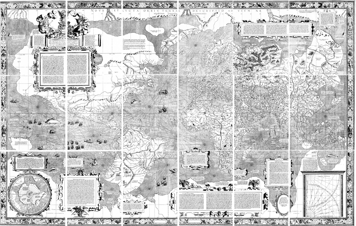
Mercator’s 1569 World Map: it introduced his projection, but the content was also partly based on the ‘portolan’ charts which featured navigational observations by sailors at sea
Mercator’s projection proved to be one of the most significant
advances in cartography; it heralded a new era in the
evolution of maps and charts and is still their basis today
Gerard Mercator’s maps gave 16th-century geographers a new way of looking at the world. His creations used a novel projection system and were partly based on the portolan charts used by sailors since the 13th century. These charts, Mediterranean in origin, use compass bearings and distances and were noted for their relative accuracy by pilots and seafarers. In the late 1500s the world was opening up to exploration and trade creatung the need for sailors to sail offshore using parallels (rhumbs) on their compass bearings, though the science of navigation was still in its infancy.
Mercator aimed to present the known geography of the world within a “correct” chart to be more useful to sailors. This “correction”, took the constant bearing sailing courses on the sphere (known as rhumb lines) and mapped them as straight lines on the plane map. This advance is what characterizes the Mercator projection. Of course by opening up the globe – to lay it flat as it were, his projection created massive anomalies in the size of land masses towards the poles – for instance making Iceland the same size as Borneo, when in reality it is about one-fifth in area (see below).
Using Mercator’s projection navigators were able to transfer their courses and headings onto a flat piece of paper. As they measured distance in degrees of latitude it did not really matter to them that polewards land masses seemed to grow in east-west width – though the fact that this made wealthy northern countries look larger than they really are is not lost on students of economic geography today..
Mercator’s map was the result of more than just ingenious insight into the existing types of projection where the artistry of the map maker seemed as important as his accuracy in days when distances were comparatively vast. He’d proved himself as a skilled instrument maker and most importantly as an engraver, using relatively new copper engraving techniques that allowed much more detail to be put into a chart.
He was born (as Gerard de Kremer) in Rupelmonde, Flanders (Belgium) in 1512, and at the age of 15 enrolled at Hertogenbosch’s monastic school where the monks taught him penmanship.. He later moved to Duisburg, now in Germany, following a period of imprisonment for religious heresy. As a young man he studied with one of Holland’s most eminent mathematicians Gemma Frisius, who persuaded a local goldsmith to let him to use his workshops and tools to make globes. By the age of 24 he was entrusted to engrave Frisius’ 15in (38cm) globe. He produced his first plane map, of Palestine, a year later. His first world map was drawn when he was just 26. Mercator developed a method (relatively speaking) for mass-produced globes using papier-mâché cores. Up until this point globes were individually made by hand, engraved or drawn onto massive wooden or metal spheres. He designed 12 printed gored panels that could be affixed to the surface of these lighter-weight spheres, to be hand-tinted by artists, with metal caps at either end. Today 22 of these globes survive.
In 1564 he was appointed Court Cosmographer to the local duke, for whom he created maps and navigational charts.
Although his charts did not sell in large numbers Mercator’s methods later proved the best way to represent our globe’s roundness onto a flat surface. His projection methods were improved and now he is synonymous with the way almost every atlas in the world looks. Appropriately it was Mercator who coined the name “Atlas” for a collection of maps, after the Greek myth, shown in the frontis plate of his first atlas. ★
See more on Mercator charts and how they are made: HERE